-
Echo Knowledge Base
-
-
- Article Page Width
- Article Layout
- Article Sidebars
- Article Page FAQs
- Embedding Google Documents in Articles
-
Add-ons
-
Access Manager
Main Page Width and Page Builders
0 out Of 5 Stars
| 5 Stars | 0% | |
| 4 Stars | 0% | |
| 3 Stars | 0% | |
| 2 Stars | 0% | |
| 1 Stars | 0% |
If you’re having an issue with the KB Main Page width, check your page builder width setting as described below. We cover Gutenberg, Elementor, Divi, and Origin builders.
If you’re using a different page builder, this guide can still help you understand the settings responsible for controlling container or page width. The key is to locate the container holding your KB shortcode and adjust its width settings to ensure it aligns with your desired KB configurations.
Gutenberg ( WordPress ) Builder
Gutenberg is now the default block-based content editor for WordPress. It allows users to create content using customizable “blocks” for text, images, videos, and more. Introduced in WordPress version 5.0, Gutenberg replaced the classic WordPress editor.
This article assumes you have a working knowledge of the Gutenberg Builder and its components. If you are unfamiliar with Gutenberg, we recommend reviewing their documentation before proceeding. Once you are familiar with the basics, you can continue with this article.
In this example, we demonstrate how a page builder, such as Gutenberg, can limit the width of the knowledge base. We have set the KB search row width to 100%, expecting it to span the full width of the website.
Additionally, we set the KB Categories and Articles module row to 1400px, expecting the module to be limited to that width.
Gutenberg Container Width
Note: On the sidebar settings, you’ll see the “Width” set to “1000px”. These settings are causing the KB’s width to be constrained.
If the container width is not visible, the above solution did not work, or your Gutenberg layout has a more complex structure, review all containers and parent containers housing the KB shortcode. One of these containers may have a width restriction applied.
Block Themes Width Adjustments
If the width of your Knowledge Base isn’t spanning the full page or isn’t as wide as desired, and you’re using a block theme, the theme controls the page width. Click here to read the full article.
Elementor Builder
This article assumes you have a working knowledge of the Elementor Builder and its components (Layouts, Elements, and Widgets). If you are unfamiliar with Elementor , we recommend reviewing their documentation before proceeding. Once you are familiar with the basics, you can continue with this article.
In this example, we demonstrate how a page builder, such as Elementor, can limit the width of the knowledge base. We have set the KB search row width to 100%, expecting it to span the full width of the website.
Additionally, we set the KB Categories and Articles module row to 1400px, expecting the module to be limited to that width.
Elementor Container Width
Note: On the left sidebar, you’ll see the “Content Width” set to “Boxed” and the “Width” limited to 1140px. These settings are causing the KB’s width to be constrained.
Elementor Container Padding / Margin
Divi Builder / Theme
This article assumes you have a working knowledge of the Divi Builder and its components (Sections, Rows, and Modules). If you are unfamiliar with Divi, we recommend reviewing their documentation before proceeding. Once you are familiar with the basics, you can continue with this article.
Checklist
Divi elements that could limit the width should be set to 100% to ensure nothing is restricting the Knowledge Base width.
In this example, we demonstrate how a page builder, such as Divi, can limit the width of the knowledge base. We have set the KB search row width to 100%, expecting it to span the full width of the website.
Additionally, we set the KB Categories and Articles module row to 1400px, expecting the module to be limited to that width.
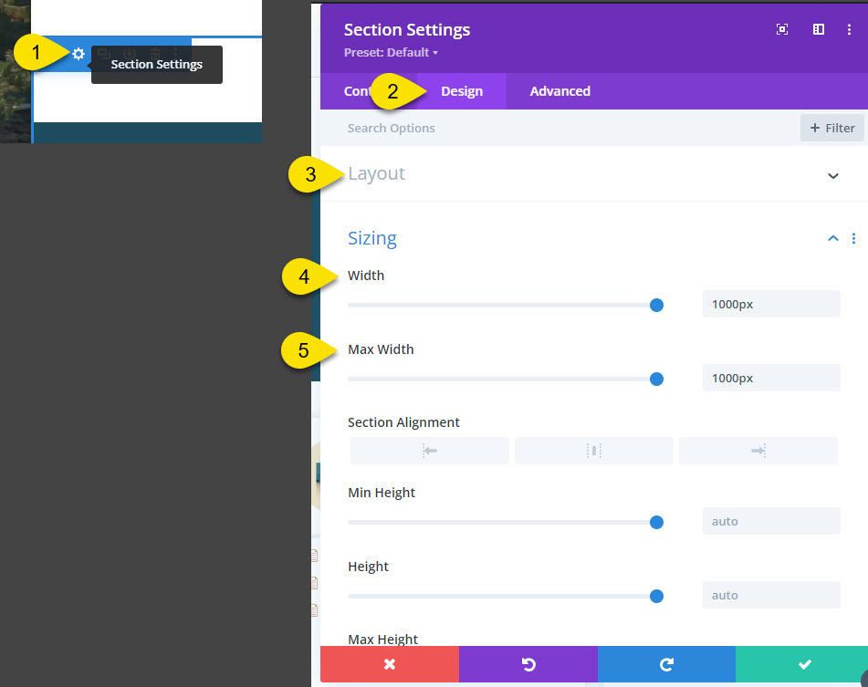
Divi Row Settings
On the front end, enable the Divi Visual Builder and click on the Row Settings that contain the Knowledge Base shortcode.
- Click on the gear icon to edit the row.
- Go to the Design tab, then navigate to the Sizing section.
- Set the width to 100%.
- Set the max width to 100%.
Save your changes and reload the front end.
Margins and Padding Settings
After ensuring that all widths are set to 100%, the next step is to review the margins and padding settings for all containers.
Page Builder by SiteOrigin
This article assumes you have a working knowledge of the SiteOrgin Builder and its components. If you are unfamiliar with SiteOrgin, we recommend reviewing their documentation before proceeding. Once you are familiar with the basics, you can continue with this article.
SiteOrigin Builder Row
In this example, we demonstrate how a page builder, such as SiteOrigin page builder, can limit the width of the knowledge base. We have set the KB search row width to 100%, expecting it to span the full width of the website.
Additionally, we set the KB Categories and Articles module row to 1400px, expecting the module to be limited to that width.
If the row container is not visible, the above solution did not work, or your SiteOrgin layout has a more complex structure, review all containers and parent containers housing the KB shortcode. One of these containers may have a width restriction applied.
Page Settings
0 out Of 5 Stars
| 5 Stars | 0% | |
| 4 Stars | 0% | |
| 3 Stars | 0% | |
| 2 Stars | 0% | |
| 1 Stars | 0% |


